She has a copy of Color Choices, Making Color Sense Out of Color Theory by Stephen Quiller. We talked about the two value scales on page 28. The first is a gray scale. The second relates orange to the gray scale.


After painting her chosen scene, she decided she wanted to go back to page 28 and consider in depth what Quiller was showing the reader.
There are at least two messages from Quiller in these value examples. The first has to do with gray scales in general. The second has to do with color and its relationship to the gray scale.
I took a color theory course thirty years ago at a local university which turned out to be one of the most valuable courses I ever took. After thinking about page 28, I decided to redo some of the assignments, too.
This was one of the first assignments. Make a gray scale. Be forewarned. This will take an entire afternoon. What seems simple is not always so.
It helps to be systematic. I squeezed out a blob of white acrylic on the left and a blob of black on the right. I mixed the values on the space between the two blobs.

I painted a page of acrylic paint swatches using a 1 1/2 inches wide brush. If you do this, remember that acrylics dry to a darker color than what you paint on the paper. Watercolors dry to a lighter color.
I only need ten steps in the final product but I know from past experience that it is smart to paint many more variations. If there seemed to be too big a value change from one value to the next, I remixed and painted the new values below my top row which I was painting left to right. When I came to the end of the space in the first row, I added my swatches under one another. At the bottom of the page I continued swatches, right to left. It helps to judge the value if the new swatch abuts the previous one.
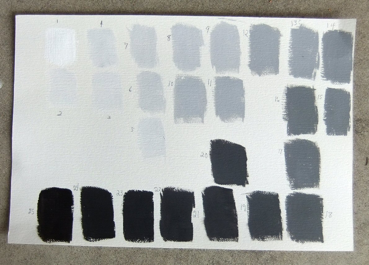
Afterward, I numbered the swatches in value from lightest to black. This is something I have learned makes the next step easier. I wrote their sequence number in the corner of each swatch or on the back as I cut them out..
To me, the next part is a bit like a puzzle. I chose a pale gray sheet of pastel paper to lay the swatches on. I laid down the values side by side, weeding out the ones that showed too little variation from one to the next. However, I kept all the swatches. Nothing is final in this puzzle.


Next I laid white on the left and black on the right and chose a value from the middle of the progression.

The next step is to fill in the spaces with values that are equal distant in value from left to right.


These were the choices I made on Monday. Since I photographed them, the values are not exactly what they truly are. Cameras come close to exact colors, but only close. There are eleven swatches. Nine or ten would be better.
These are the choices I made on Tuesday. Above the row are the swatches I pulled out and replaced. When I clicked on this photo and enlarged it, I decided I can probably pull out number 30, the next to the last square. That would leave ten color values. (You can enlarge the photos by clicking on them, too.)


Value is relative. It depends on the lighting. The first set of swatch selections was made in my basement studio. The second set of selections was made on our patio this morning. Add to the lighting variation, the fact that each person's eyes and brain see differently. All we can come up with is a best approximation. But this approximation is of great importance in all art work whether it is considered a craft or fine art.
If you are wondering why there are 25 swatches on the original sample swatch page but 31 in my later samples...I want to save an example of the order in which I paint the swatches. The first page I painted had 31 swatches, the second page had 25.
Actually, an infinite number of values can be mixed. However, we don't need that many to make a Gray Scale. As an artist becomes more aware of value variation, he or she might be able to make a gray scale with even fewer swatches to choose from. I would rather have too many choices than to have a gap somewhere so I must go back and make more value swatches.

This is so interesting, Pauline. I've never seen it laid out like this before :)
ReplyDeleteWell I learned something! Thanks! The way you explain it makes it sound so simple! :)
ReplyDelete