Showing posts with label Color Theory. Show all posts

Monday, November 10, 2014

Lilian Nichols, October Class, Purple and Gold Leaves

Lilian has been encouraging us to try unusual combinations of colors. Here is a Skinner Blend she made using Gold and Purple.  Before she began blending, she mixed a little white into the purple so it would show as purple after baking, not dark brown.


She showed us several ways to stack it .  For this stack she kept the blend in a single sheet and folded it back and forth.


A few days ago I decided to make a Gold and Purple Skinner Blend and see what I came up with.  i started in the usual way remembering to fold the purple to the purple and the gold to the gold..


After I blended the colors,  I made a stack and started experimenting.  I added a few extra layers of gold and purple to the stack to get a little more contrast.  The completed leaves are in the middle of the photo.  To the right is the bead skewer I used to poke holes through the stem ends so I can string them on a necklace.  At the bottom are scraps which I made into a cane and then cut it into a Natasha bead.  The Natasha technique is the one that we used to make carolers and angels in an earlier class.


Part of the stack I cut into triangles and made leaves in which the layers mimicked  veins in the leaves.

Here are the leaves and the Natasha bead after baking.  That's when I realized I had forgotten to add a bit of white to the purple.  The purple looks more like burnt umber.  Oh, well.


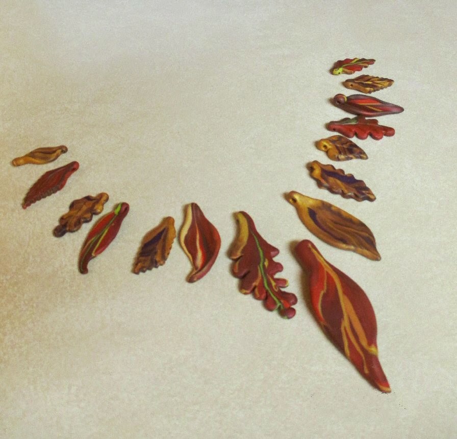
I put together another array using the leaves I had just made and the leaves I made in September.


Thursday, November 6, 2014

Lilian Nichols, October Class, More experiments with Color and Techniques

The sheets of rolled polymer clay that Lilian started with are in the foreground of the top photo.  One stack is at the far back.  In the spot of sunlight is a stack wrapped with beige, another kind of stack to begin with.

Below are the layers twisted with purple added, a color she told us works well with autumn colors.


The rest of the examples are the results of Mary Ann's and Sally's experiments.  


Sally added a generous amount of glitter to her clay before she stacked it.  Then she pinched both ends.  Playing around she twisted the clay into the shape below.  We decided this would make a good ornament to hang on the Christmas tree.  It would also make a good small gift for a gift exchange.


Using the same stack, Sally twisted it another way and came up with this gourd.


Her next experiments were with a texture sheet, a rubber stamp and Pearl Ex.


The bits of flowers on the upper edge are from the texture sheet.  After stamping a leaf rubber stamp on the clay, she used a small brush to carefully brush Pearl Ex on the imprinted leaf design.


Mary Ann made a cane with circles.  After rolling out  the sheets of colors she wanted, she cut circles out of each one and stacked them.


Here is the beginning of her stack.


Here is her stack after being compressed and stretched a  little.


Here are some of her leaves.

1.


2.


3.

The three upper leaves in photo 3 were textured with a texture sheet, then brushed lightly with Pearl Ex.  The leaf on the bottom is the same as the one in photo 2 but a bit of Pearl Ex gives it a sheen.

Tuesday, November 4, 2014

Lilian Nichols,September Class, Experimenting with Autumn Leaves

In September, Lilian brought some of her fall necklaces to show us.  Lots of them involve autumn leaves in various combinations of colors.  Our project was to experiment with fall colors using Skinner Blends and bull's eye canes.  Lilian also suggested we try some unusual colors just to see the results.


Below is a closer view of the one Lilian is wearing.


I especially liked these leaves that Lilian made.


She rubbed a little Pearl X which is a metallic powder on the leaves after she made them but before she baked them.  A very little Pearl X goes a long way so Lilian suggested using a finger to pick up a bit of it on the lid rather than poking our finger into the jar . It adds a shine to the baked clay. If too much is rubbed on, the colors of the project disappears.


Other leaves that Lilian brought as examples are in this photo.  The two leftmost leaves were made by mixing layers in a cane.  The next two are made from unmixed layers.  The stylized leaves were made by wrapping dull green around orange bull's eyes.  The largest leaf is an example of making an oak leaf.

Below are the colors Annette mixed.


And here are leaves she made, Some are made from Bull's Eyes and some are made from layers of color.  The one in the middle was made from left over scraps.


Below are Linda's experiments using layers, and using bull's eyes.  She also accepted Lilian's challenge to use unusual colors for her leaves.


Update December 2014

Annette brought in two necklaces she made using techniques she learned in this class and the October class.  See them below.


Thursday, February 13, 2014

Using a Commercial Gray Scale to Recognize Values

I find keeping a  gray scale handy helps when I am painting.  You can make your own as I showed in an earlier blog.  I find making a gray scale made me more aware of the infinite variations of grays.


You may decide to buy a commercial gray scale.  The grays are ten percent gradations.


Another possibility is to use your computer to change your painting to gray scale to get ideas for continuing or to confirm that you have a variety of values in your painting.  Here is an example of checking values by changing a color painting to gray scale.


From color to gray scale


It helps to know the value of colors as they relate to the gray scale.


Here is the same photo but changed to gray scale with the computer.  You can see that the bit of neck surrounded by  the 10 percent gray keyhole is even lighter than 10 percent gray.  The third value down, 30 percent gray is close to the bit of scarf in the keyhole.  That orange is close to 30 percent gray.


Using  value contrast is one key to making a  painting that attracts the viewer.


Wednesday, February 12, 2014

Relating Complementary Color Studies to the Gray Scale

It is February 18 and I am revising this post.  I'm still trying to clarify what I am saying in my own mind.  I probably will revise this again.  Thank you, Far Side of Fifty, for your input.  I  realize the original post was as clear as mud...generally a very deep value in this part of Ohio.

Value is an important aspect of color.  I have read many places that a painter can use colors that have no relation to the actual subject but if the values are correct, the painting will seem "right".  I've chosen to select complementary colors to simplify the color choices.  I noticed when I started looking closely at complements that while they are always opposite one another on the color wheel, their values can be similar or very different.


Let's start with a gray scale.  This is the eleven step one that I made. If I leave off the first square which is white, the scale is one that is  commercially available in a number of different forms, ten steps with 10 percent gradations.


Cadmium Red Medium and Pthalo Green are above and below I have turned them to gray using the computer.  You can see that they are very close in value.  


The entire range of Cadmuim Red Medium to Black to Pthalo Green tends to be filled with  values from midway  toward the black range on a value scale.


If you paint a picture or decorate a room using this red and green, chances are you will want to add a third color with a paler value or add white to the red and /or green.


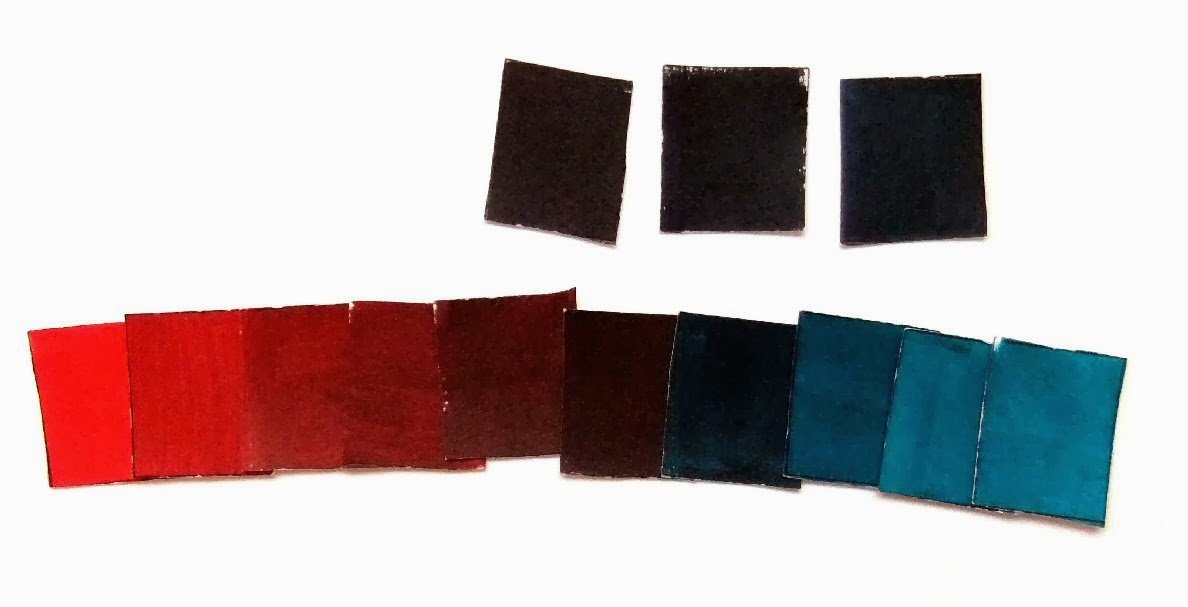
.Here are portions of  the same scale, Cadmium Red Medium to a mixed black using Pthalo Blue.


Here is the other side, Pthalo Blue to black.


Let's look at Cadmium Yellow Light and Dioxazine Purple, two other complementary colors.


Here they are in gray scale.


This time the complementary colors vary widely in value.


And the resulting value scale looks much different from the Cadmium Red Medium to Pthalo Green scale.  A lot of dabs of purple can be mixed into yellow to make various values before the mixer arrives at black.


Here is the Cadmium Yellow Light side as it progresses to black.


Here is the Dioxazine Purple to black side.   It doesn't take  near as much yellow to change purple to black.


With this complementary choice, a picture could be painted without using white or another color and there would be a wide variety of values.

There are many more complementary color combinations.  Each one has its own characteristics. And one of the characteristics that varies is value as one complementary color mixed with its opposite moves toward black.